Geographic
Deliverables
Brand Identity
Studio
Matter Of Form
Role
Lead Designer
2025
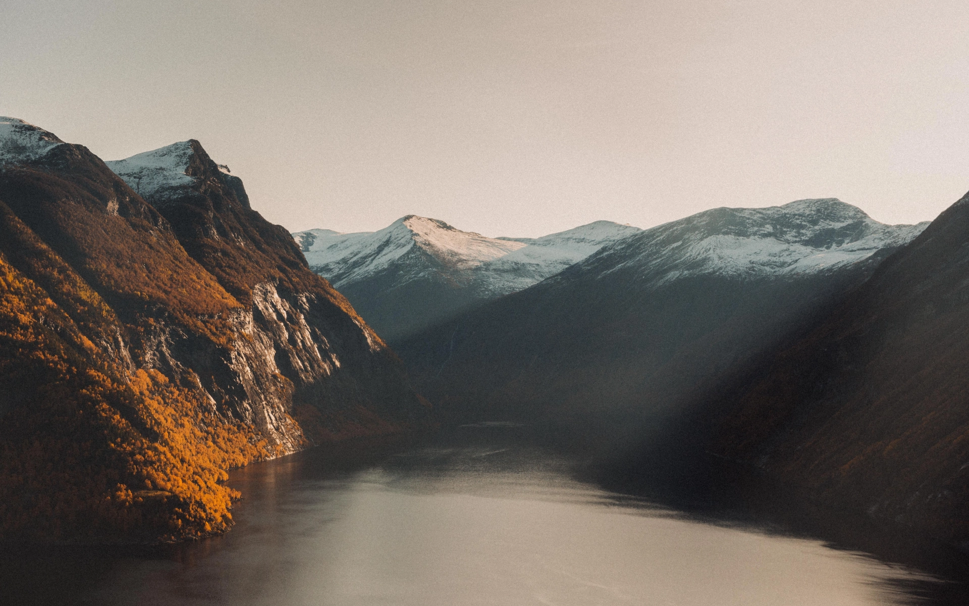
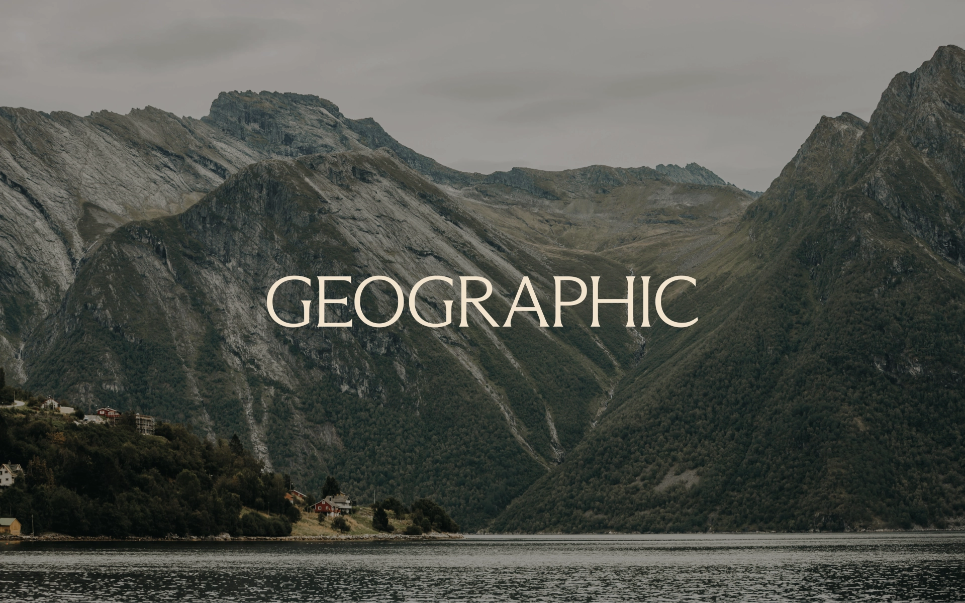
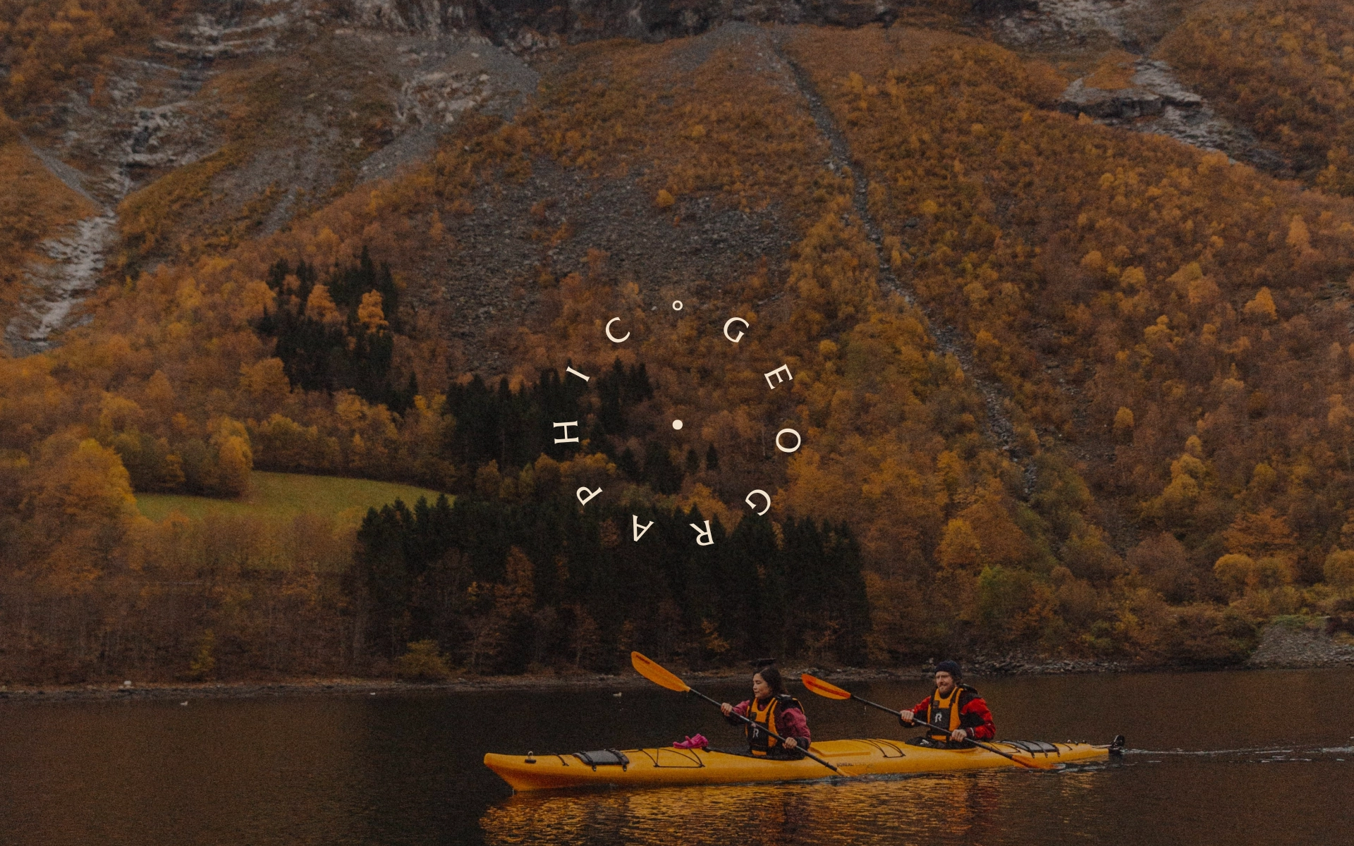
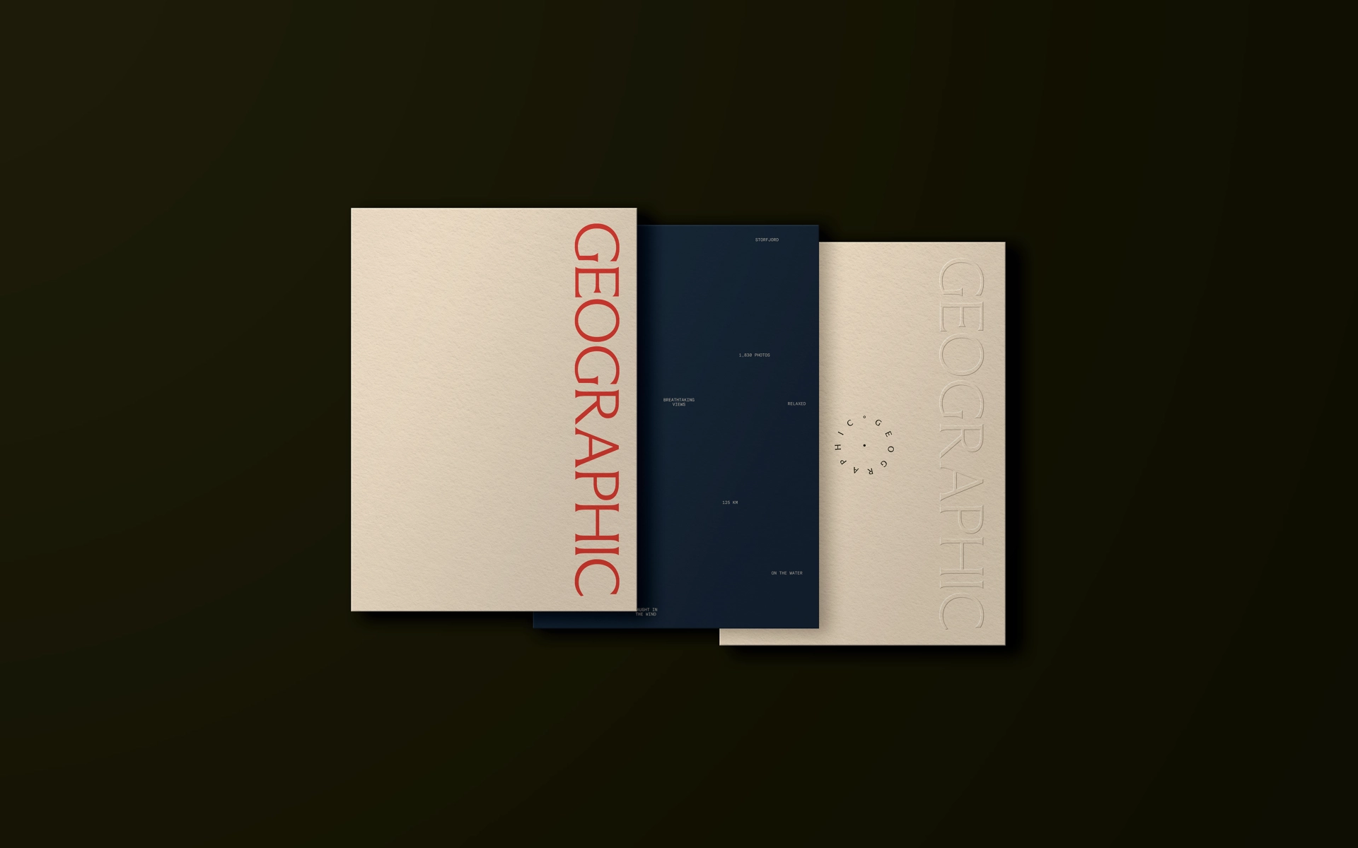
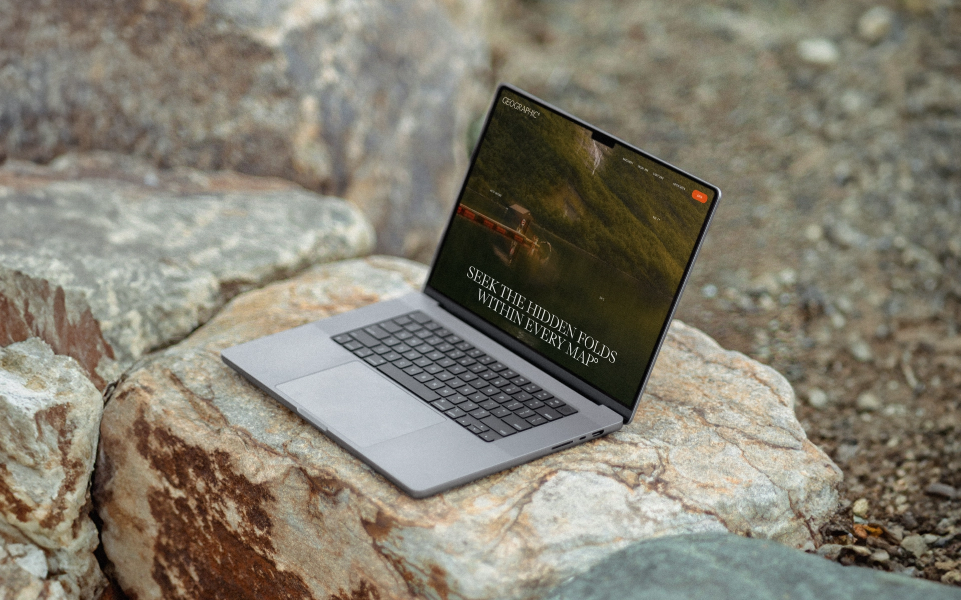
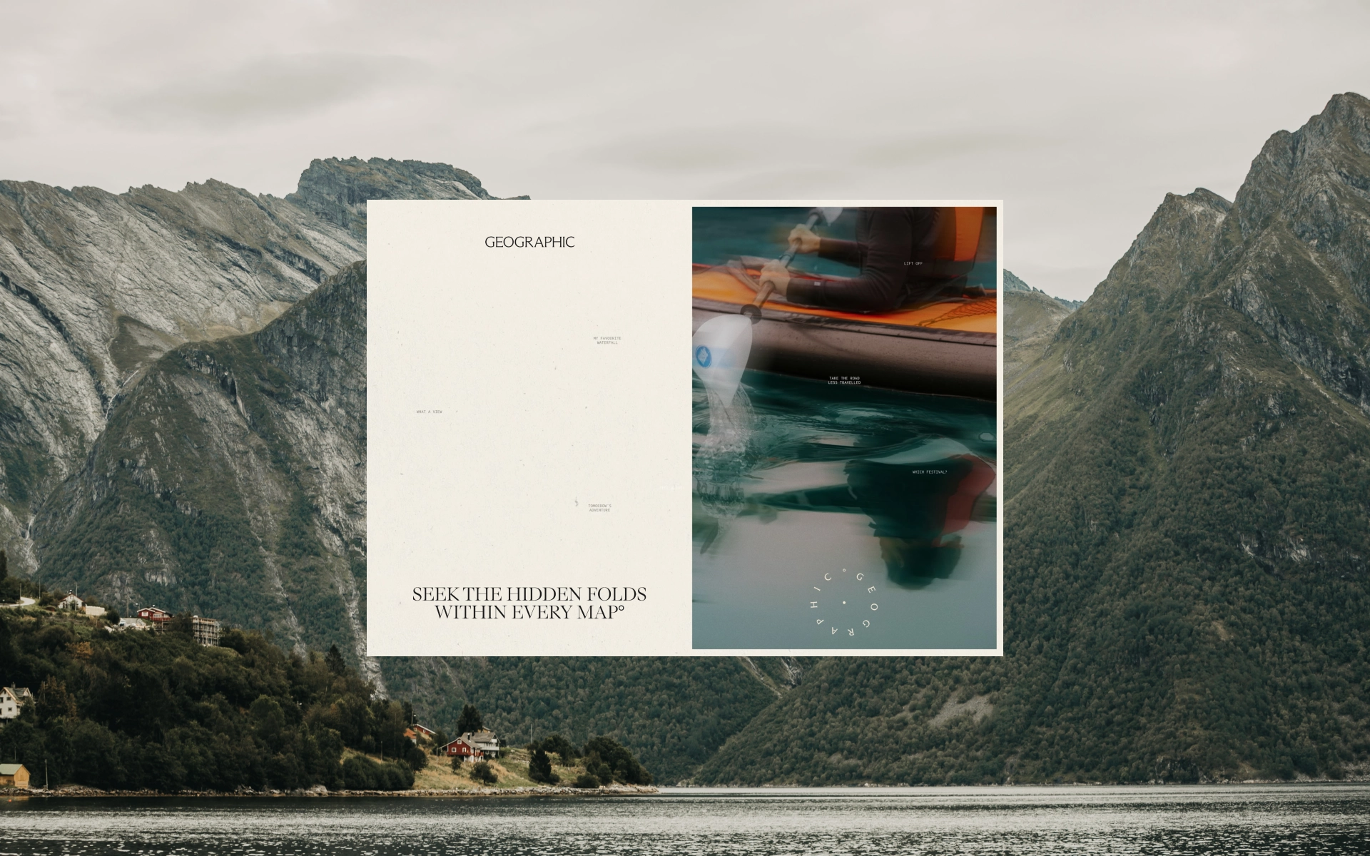
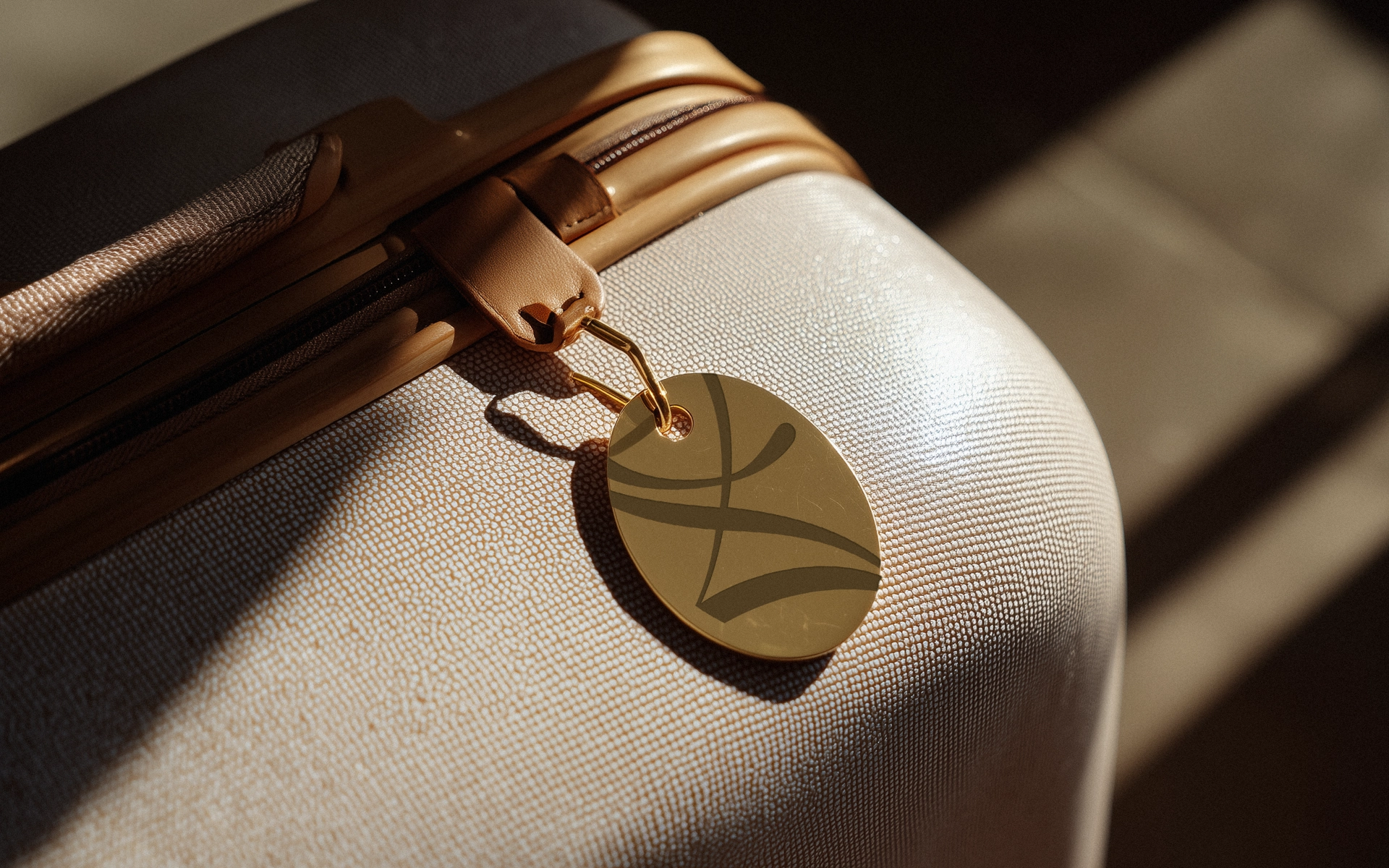
Geographic is a collection of boutique hotels in Norway. They also run adventures around them, from cross-country skiing and long bike rides to helicopter and speedboat trips, and they’re big on looking after the landscape they play in.
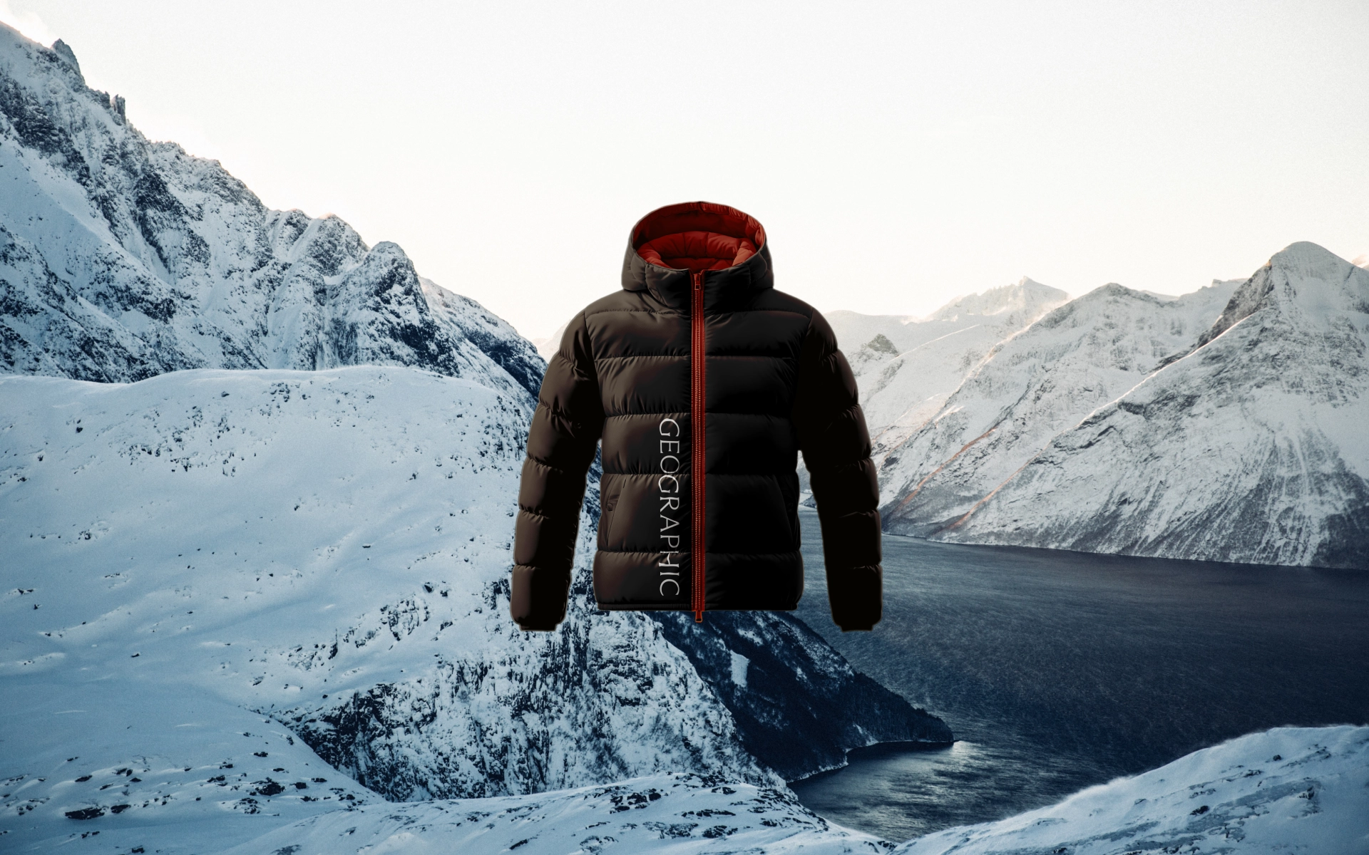
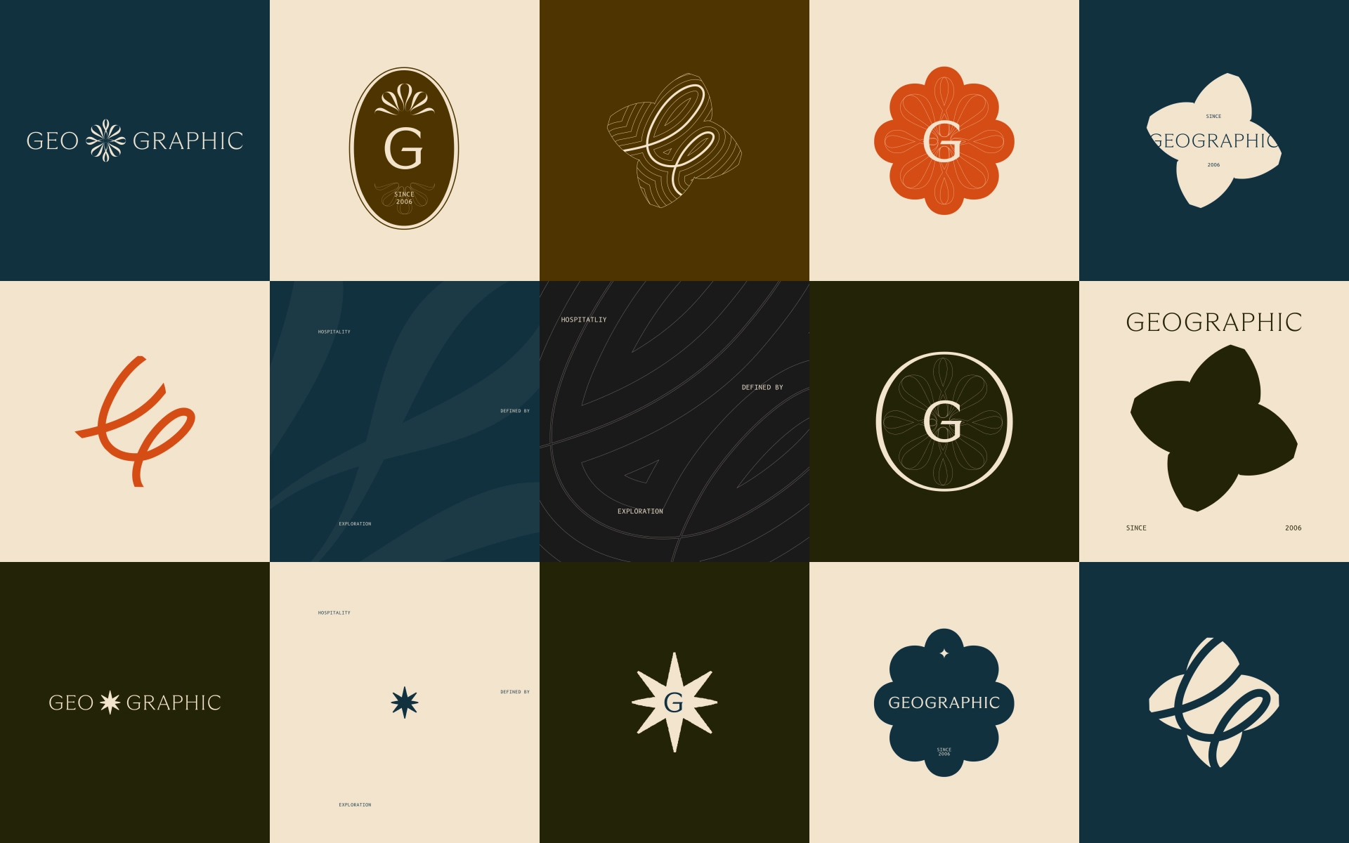
The idea we built everything around was one line: “Seeking the hidden folds within every map.” It steered us away from the obvious compass and towards something quieter, about finding the parts of a place most people miss. That idea shaped the identity without shouting about it. We kept a nod to the old compass logo by using the wordmark and the compass hand, which gave us room to play with how the name is angled and placed.
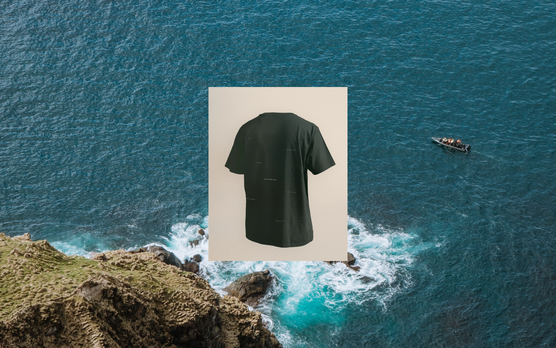
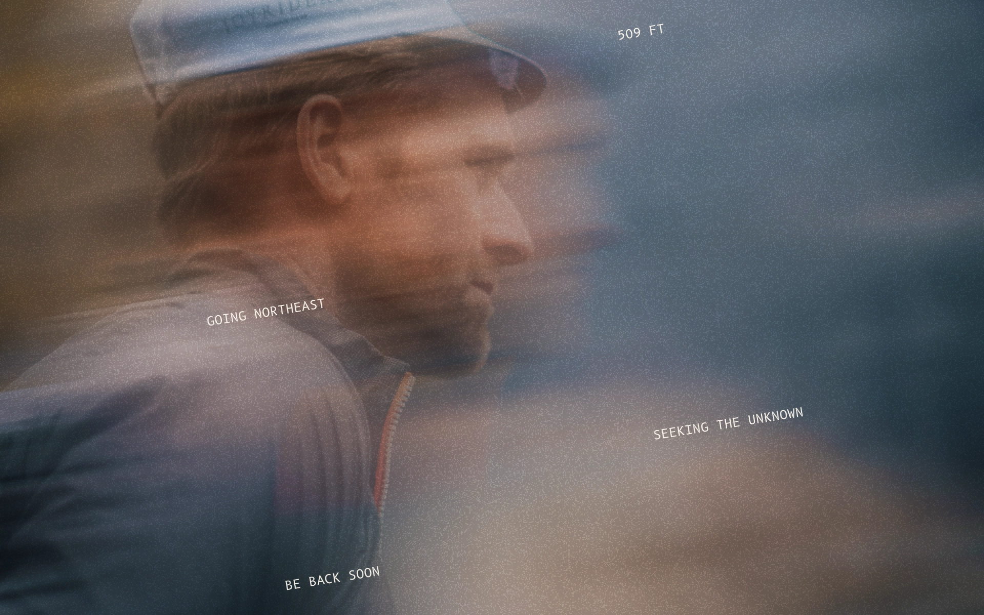
A nice touch was the place markers. They sit on top of textures and imagery like pins on a map, but instead of naming a place, they hint at what’s happening there. “Going northeast” says adventure. “What a view” and “my favourite waterfall” say you’re connected to the place. It’s a small thing that does a lot of work.
The brand plays on the contrast between adventure outside and cosy comfort indoors, because each makes the other better.